One of my goals for 2022 is publishing a couple of books. While one of the books has yet to be determined, the other one happens to be a children’s book that I conceptualized last year as I was doing some reflecting. As I let the idea marinate inside my below-average brain, the question I asked myself was what do I wish I had learned as a kid that would have made my life better (a topic for another day)? Fiscal responsibility was one of the first answers to pop into my head. With that theme lodged in my mind, I decided to try and create a children’s book while using Canva to create it.
Why Canva? The biggest issue is that I can not draw. At all. I’m lucky if I can draw a straight line and it is difficult for me to draw a decent stick figure. If I were to try and Bob Ross a painting with the man himself, it would turn out as a sea of black while he is painting a snowy landscape.
So this happened to be my big hang up when trying to design the book. I don’t know any artists, nor do I have the funds to pay for an artist. It’s the same issue I have when coming up with simple designs for my Redbubble shop. Luckily, when I decided to start my shop, I found Canva which made it easier for me to come up with designs for shirts and other merchandise (as simple as they are). Thus, I wondered if I could try and use Canva to create my book.

The book itself is about starting a business and being responsible with the money. But simplified as much as possible for a child to understand. In a nutshell, I want it to appeal to kids but treat them like adults. In other words, more reading and less pictures for them to look at.
Yet, what kind of business do kids want to try their hand at? The answer was obvious: lemonade stands. It’s one of those things that a lot of kids will try to do on a hot day and parents tend to encourage it for a multitude of reasons. Mostly because making and selling lemonade is a rather cheap and easy thing to do depending on how invested the child wants to be when making the attempt.
With these three concepts in mind, I started scouring Canva for pictures that I could use for the book. I have to say, it took me quite a while to find the right elements for the cover on which I would base the book’s aesthetics on. But, after a couple hours, I found enough elements to create a book cover and I took off from there.
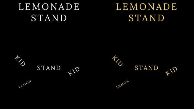
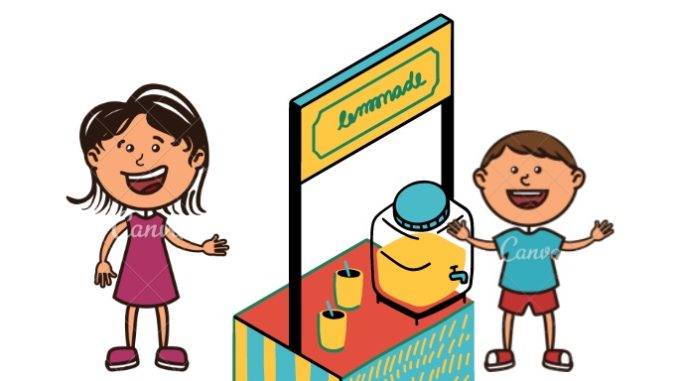
The cover I envisioned would be simple. Image of a lemonade stand, a couple of kids, and lemons. Then I had to think about the font color and type. Since this was going to be for children, I wanted a font that would look as if a child might have written it. The color? That was easy to decide on: yellow. But I would need to find the right shade of yellow.
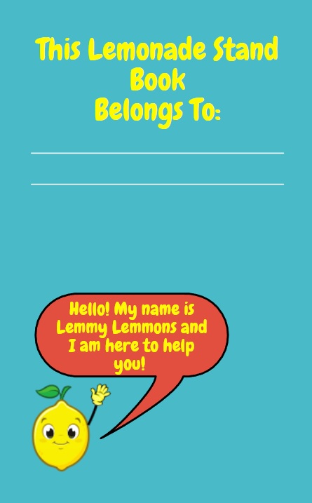
Yet, even though choosing the text color was simple, it presented a problem. Deciding on yellow meant that the paper’s color would need to compliment whatever shade I chose. White paper was obviously out unless I went with a dark or mustard yellow (even then, it wouldn’t look great). Black paper wasn’t exactly a cheerful one despite it being one of my favorite colors. So I started experimenting with various colors and I found none of them satisfactory. Then I looked at the images I had on the book cover and tried one of the colors that was used for the lemonade stand itself.
And I liked the result!
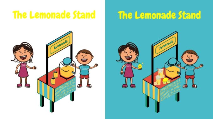
The shade of cyan used for the paper meshed well with the shade of yellow I was using and, with that decided on, I started writing and designing the interior of the book. Which I am still in the process of doing. I must confess, I am having a hard time trying to make sure that I am conveying all of the necessary information I want to introduce a child to when it comes to making a business and selling a product.
I’m not going to show too much of the book’s interior for one simple reason. No one, that I have seen after scouring the internet, has created this kind of book for a child. Of course, I could be looking in the wrong places or not typing in the appropriate search terms but I’ll have some people I know double-check me on this. The worry, as always, is the reason why I’m not seeing anything similar to what I am doing is because it doesn’t work.
Which is always a writer’s fear and the writer’s conflict. That their idea is not good and that no one will understand it or care about it. Even worse, that it is stupid.
I think that the latter, personally, is the worst. I can accept criticism that my writing is not great. But if the kernel of what I am saying is stupid or not valid? That cuts to the quick. Because I’ve tried to make sure I get things right. It’s how I have always approached my writing no matter what it is about.
Yet, I digress.
If someone were to ask me if you can design a children’s book in Canva using its assets I have to say yes and no. Yes, if you are designing a book like mine that is very minimalist in the use of images. No, if you are designing a traditional children’s book that heavily relies on imagery to convey your story. Can the latter still be done, though? Possibly, but not probably. Finding the right images is tricky enough, but finding enough of them with a similar style will be difficult unless you find one of their creators who contributes to its ever-increasing amount of assets.
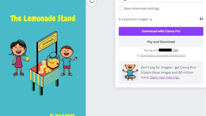
It’s hard for me to say this one with absolute certainty because I am not using a Canva Pro account.
For now, though, it is working for me.
But what do you think? Do you like the cover I came up with? Let me know in the comments section below or on social media. And be sure to check back as I will be posting additional articles about why and how I came up with the concept, whether or not I will publish or self-publish, and some of the ideas I have to make this book generate additional revenue.
Author’s Note: Support this site by donating via Paypal or even checking out our merchandise on RedBubble where you can find designs that cater to writers and readers. Money donated and raised goes into paying for this website and equipment.
